
RETAIL AND PRESENTATION
Dear Readers,
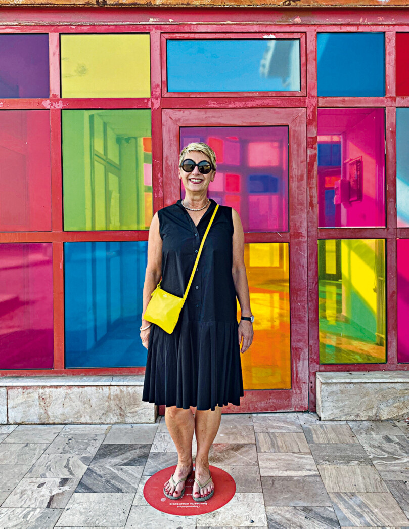
the good news first: during the last lockdown, many retailers used the time to make their shops more attractive to customers – well aware that customers are looking forward to real shopping experiences after a long absence. The will to invest is thwarted by faltering supply chains and costs for fit-out materials and a shortage of craftsmen. Now who wants to be pessimistic? Certainly not us in this issue on sales and presentation! During my holidays in Thessaloniki, I was not able to wander through the redesigned Modiano Market Hall – because it is still under construction – but I discovered an aging but still very cheerfully coloured harbour building. Colours were definitely not used sparingly in the selected shopfitting and exhibition projects either! Pastel shades enhance the Pangaia pop-up shop in London, coral brings life to the Mykita eyewear shop in Berlin and yellow-orange makes the cannabis store in Toronto fit for society. The fact that the traditional Swabian department store Breuninger presents itself in Sachsenheim in sensual, exciting red was worthy of a cover design. Colours structure and highlight exhibition concepts, such as the one on Buckminster Fuller in Madrid or on the history of handbags in London, and they create visual stimuli for a broader audience. This is also the subject of our article Eye Candy, in which architecture journalist and szenography expert Janina Poesch writes about selfie museums and their instagrammability. Things will certainly be colourful at Art Basel from 24 to 26 September. Art enthusiasts should read our article A weekend in Basel. We visited a beautiful new building project in Ruit: Haus Liselotte was not colourful enough for this issue though, we´ll show it later! Stay healthy and happy!
Best wishes
Petra Stephan, Dipl.-Ing.
Chief Editor
Architect
E-Paper Order sample copy Order current issue/subscription Cover competition
READING SAMLPE
Alle Serienbeiträge aus »Issue 9.2021«
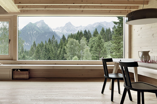
Innauer Matt (AIT9.2021)
Wood has always been part of David Stanzel’s life. As the offspring of a carpenter family, Stanzel, born in Bavaria, alw …
Go to article
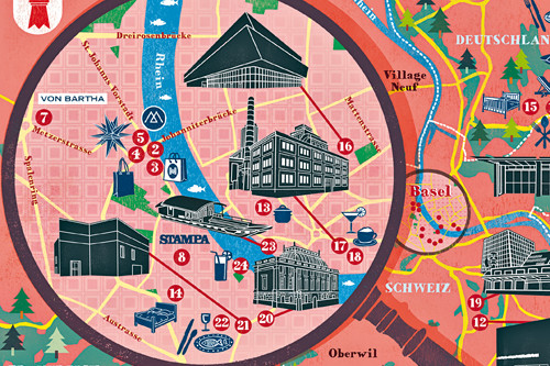
Basel (AIT 9.2021)
Switzerland’s third-largest city is considered the cultural capital of the country. With numerous art- and cultural inst …
Go to article
Farmers (AIT9.2021)
The longing for the countryside is as present as never before in times of ever greater urban challenges. Anja Kluge and …